This week's artist is Nate and he declined to be photographed, which just means I'll post more pictures of his artist achievement.
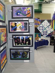
Every year our school district hosts a district wide art and science fair show. My kids have been featured pretty regularly for the past eight years. It is an honor to be selected since space is limited. Each school is allotted a small area and it is up to each school's art teacher to make the selections. Nate scored two slots this year for two very different projects.
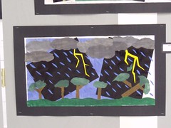
The first one featured here should look familiar, you can see it on the bottom of the display.
Yes it's the big version of the collage featured last month.
It turns out the smaller picture was his mock up in his art journal. I had no idea there was a larger and more finished version until I turned the corner and saw the picture on the display board. It was quite a surprise for me! I instantly recognized it and didn't have to read the name tag.
There are differences between the two pictures and I can't decide which I like better. I think it's a very good thing that the picture had changed from the original journal entry. To me it means that Nate thought about what he was doing and how he could better convey his ideas.
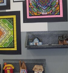
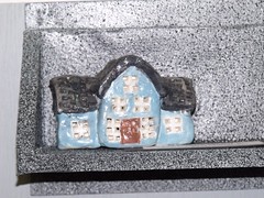
As for Nate's second piece, he had described it to us so it was much easier to find. His class had made small clay houses and his was a bit different from the others. Most are a traditional boxy house, while Nate's has not just one wing but two. He wanted to make something a bit more like our house. He's a bit mistaken on the wings, but he did get the door right.
The color he glazed the house was in his opinion flat out wrong. He envisioned something very different, more grey than blue. However as he painted this little house and realized his mistake Nate decided it would work despite the addition of too much blue. I think he is right on both counts if I correctly understand what he intended.
Either way I find the house to be utterly charming. I love the details in the windows, he did a nice job in both placement and color. As to the window panes themselves it looks as though he punched out each pane of glass.Also Nate texturized the roof to create the illusion of shingles. It's lovely little house and certainly deserving in inclusion in the exhibit.
Nate did a bang up job on both of this pieces. Both are well deserving of inclusion in the school district wide art exhibition.


No comments:
Post a Comment